2018 has been an exciting year for web design.
The only way I can think to sum it up is with a quote from one of my favorite shows, The Office.
In the series finale, Andy says “I wish there was a way to know you’re in the good old days before you’ve actually left them.”
Well, this is me, giving you the heads up that we’re currently living in some of the most exciting times in the web design.
In the last year, we’ve seen advancements in technology that help connect us better with our users, new styles that are pushing the boundaries, and a stronger focus on documentation and accessibility guidelines to make the web a more consistent and accessible environment for everybody.
With so many developments, it’s important to slow down and take a look at what trends will stick around and what new things we can expect to see in 2019.
Here are some of the more notable things we can expect to see in web design in 2019.
1. Flat Design
Flat Design is a minimalist design approach that features the use of clean and open space, bright colors, and simple two-dimensional illustrations.
This style of design started off as just another trend, but over the years, it’s grown to become the standard for web design.
The rise of flat design can be attributed to the need for fast-loading websites that provide users with an enjoyable browsing experience on both mobile and desktop.
Flat design relies mainly on simple illustrations which are much less data-heavy than sites that use large images or heavy visuals. This means an overall much quicker loading time.
This style of site is also preferred by many users from a UX perspective.
Reducing the clutter and unnecessary ornamental parts of a design helps users to focus on the important parts and make it easier to navigate.
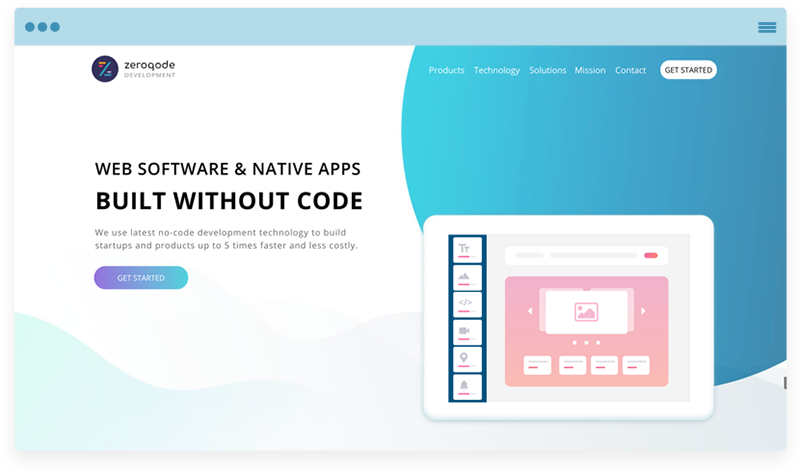
App development platform Zeroqode uses flat design on its website to present users with a clean yet friendly appearance. The use of bright colors in the hero illustration grabs users attention while also communicating to users what the company does.
2. Animated GIFs
Today’s user is in an “instant gratification” mindset when it comes to finding the information they’re looking for.
That means we only have a small window of time to capture their attention and provide them with what they’re looking for.
This is where animated GIFs really shine.
GIFs can convey complex ideas in a short period of time while being engaging and entertaining. An added bonus is they also work on most browsers and mobile devices, making them accessible to everyone.
In the example below CarLens, a car identification app, uses an animated GIF in its hero section to quickly show the type of information you can find about a car using their app. The GIF is engaging and makes users interested to learn more.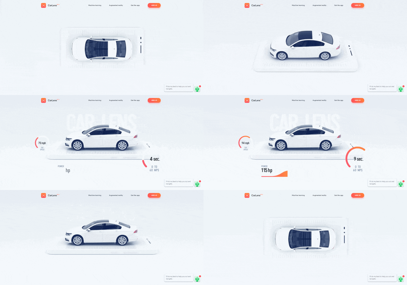
3. Conversational Bots & Machine Learning
Last year, we talked about the rise of conversational bots and machine learning on websites.
Since then, chatting with bots has become second nature. We’ve seen huge advancements in artificial intelligence and the capabilities of bots.
Heck, we see it every day when Google gives us auto-suggestions or when Facebook asks us if we would like to be tagged in a photo.
Many companies are seeing the benefits bots can bring to their organization including:
- Greater convenience by giving users instant responses and filtering them to the appropriate contact based on their issues
- Improved efficiency by allowing for easier and time-saving transitions between cases.
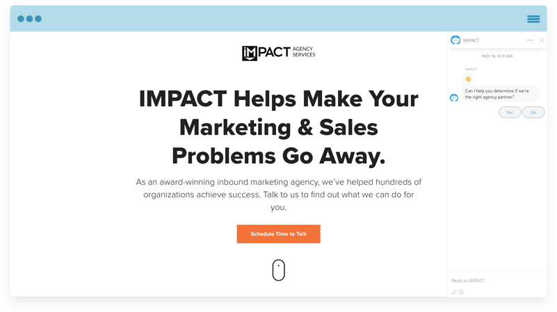
At IMPACT, we’ve integrated Drift onto our agency services pages to help us connect instantly with our prospects.
4. White Space
As mentioned above, web design is moving in more of a “less is more” mindset.
That means we’re seeing websites opt for simpler layouts with greater amounts of white space. White space (also referred to as negative space) is simply the empty space on a page. Think of it as the breathing room around page elements.
Using white space to separate the different sections on your pages helps improve readability and makes it easier for users to digest important information.
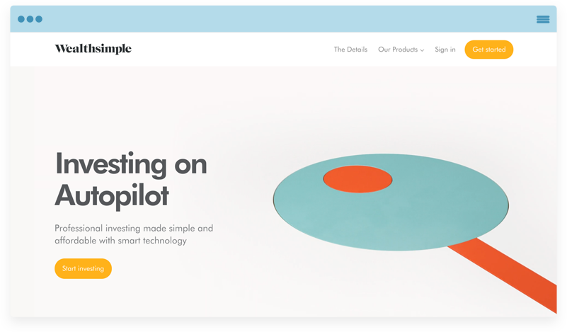
Wealthsimple, an investment app, uses whitespace to break up each section of its site allowing for users to focus on one section at a time. It then uses clever animations to direct user eyes down the page.
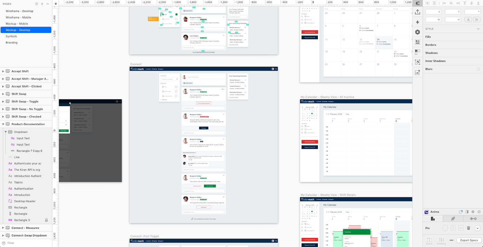
5. Sketch as the Go-to Web Design Software
Over time, there’s been endless, polarizing debates in the tech world; Mac vs. PC. GIF vs. JIF. Apple vs. Android.
For those in the web design space today, we find ourselves in the midst of a battle for top design tool: Photoshop vs. Sketch.
For years, Photoshop was the go-to tool for executing web design, however, over the past few years, Photoshop has begun to lose ground to Sketch.
Sketch is a software that’s built specifically for web designers and can cover the majority of the design process from creating designs to prototyping to client presentation.
Due to Sketch’s powerful open-source library of plugins and its ability to handle so much of the design process, I’m predicting in 2019 more companies will begin to make the switch away from photoshop and move over to using Sketch as their main design software.
6. Broken Grid & Asymmetrical Layouts
Recently, web design has put a lot of emphasis on designing within a set grid.
A grid system helps designers maintain alignment and consistency throughout a design and frankly, makes it easier for developers to bring it to life.
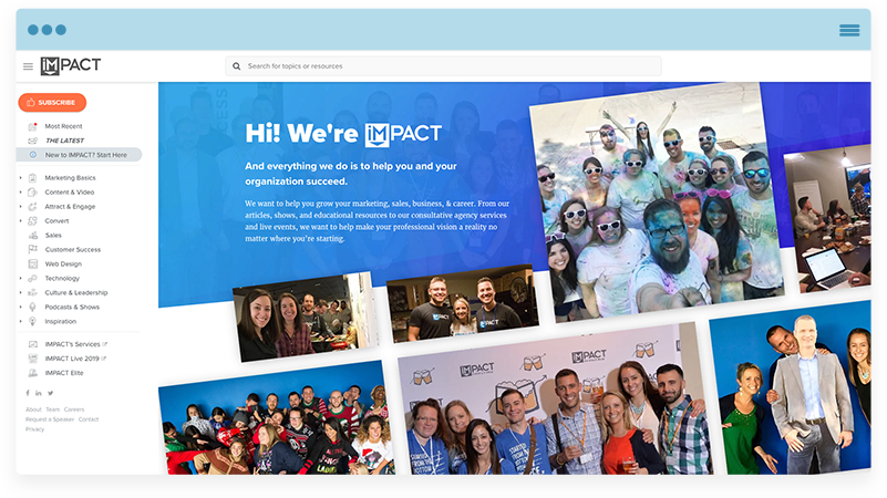
However, we are beginning to see designers break outside of the standard grid more and more. This helps designers have more creative freedom with their work and create another level of hierarchy on a page.
Creating this extra level of hierarchy is extremely helpful when it comes to guiding a user’s eyes down a page and pulling them into the most important actionable parts of your site and frankly, it allows for more intriguing and unique designs.
At IMPACT, we’ve taken this approach on our About Us Page in order to help break up the content a bit and call extra attention to our team photos.
7. Design Systems
Simply put, a design system is a collection of reusable components guided by a set of rules, constraints, and principles.
Over the last year, these systems have become an important piece of many teams.
Major companies such as Shopify, Trello, and Airbnb have led the design system charge by building out in-depth systems and even dedicating pages on their sites to them for everyone to see.
When implemented, design systems help teams reduce inconsistencies and speed up your design process.
Shopify’s design system, named “Polaris”, takes users through in-depth sections explaining the “why” and “how” onSshopify’s color, typography, and UX design.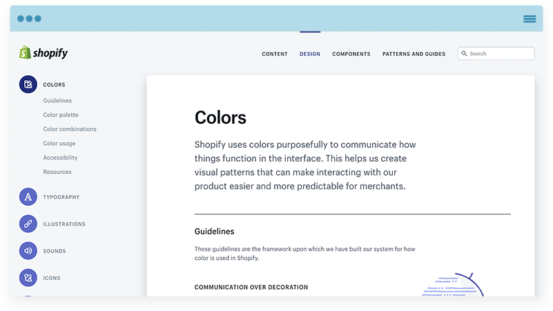
8. The Use of Organic Shapes
An organic shape is any shape that’s irregular and uneven. In other words, this is a nice way of saying imperfect.
They appear more hand-drawn and humanistic. With their unusual appearance, these can be used to grab a user’s attention and add a personable touch to your site.
When combined with an illustration or image, they can also really add a nice level of depth to your site, breaking up the monotony of the same circles and squares we’re used to seeing in design.
In the example below, Designer Ariful Islam, uses organic shapes to give this page a more approachable feel and call some additional focus to the imagery used on the page.
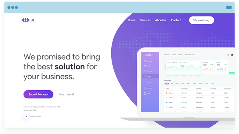 Image: UI Agency by Ariful Islam
9. Website Accessibility
Alright, this last one isn’t a trend, but it is a movement that can’t be ignored in 2019.
If you’re new to accessibility, it has to do with the design of a website for individuals with disabilities. When websites are properly designed and coded, people with disabilities can easily use them. Unfortunately, there are currently many sites out there with accessibility barriers making it difficult for those with disabilities to use.
As WCAG 2.0 (Web Content Accessibility Guidelines) become more commonly enforced, it’s going to be increasingly important to make sure your website is up to par.
The web is an important resource in all of our lives so it’s important to make sure it provides equal experience and opportunity, regardless of how it is being accessed.
If you’re looking for some helpful resources to get your site up-to-code, you can visit the full list of tools recommended by W3C, the community responsible for developing the standards for the web, here.
Looking Ahead to 2019
So there you have it, the top nine trends that I think will shape the way we design in 2019.
From an aesthetic point-of-view, I believe we’ll see websites continue to move toward the clean and practical style of flat design. From a UX point-of-view, we’ll see companies make a push to make their sites accessible for everyone and implementing more conversational bots to give users a quicker response time.
Designer, HubSpot Design & GDD Certified, Designer for 70+ Sites for HubSpot and Various CMSs


Leave a Reply